
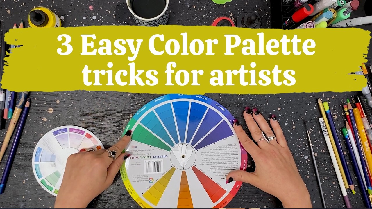
3 Easy Color Palette Tricks for Artists
Want to check this post out on Youtube? Click HERE!
Ever want to start a project and immediately get hit by overwhelm? If you’re anything like me, you’re like “Oh my gosh, there are way too many colors to use.” And then I just shut down. I’m like “I don’t even know which one to use. It’s not fun anymore. I don’t want to make any art.” Well I don’t know about you, I hate feeling like that, so I have some tricks I use for quickly picking out color for art and sewing projects!
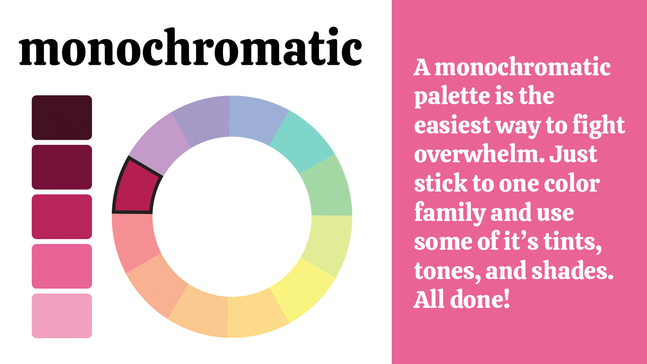
First: The easiest way to fight overwhelm and keep things really simple is to stick with a monochromatic palette. Monochromatic literally means one color. Using your color wheel, you can identify which color family you’d like to use, and then select your colors from the whole color range of tints, tones, and shades! (If those sound like new terms to you, a tint is a color with white added to it, a tone is a color with gray added to it, and a shade is a color with black added to it!).
• A little vocab for you: Adding White makes a Tint, adding Gray makes a Tone, and adding Black makes a Shade!
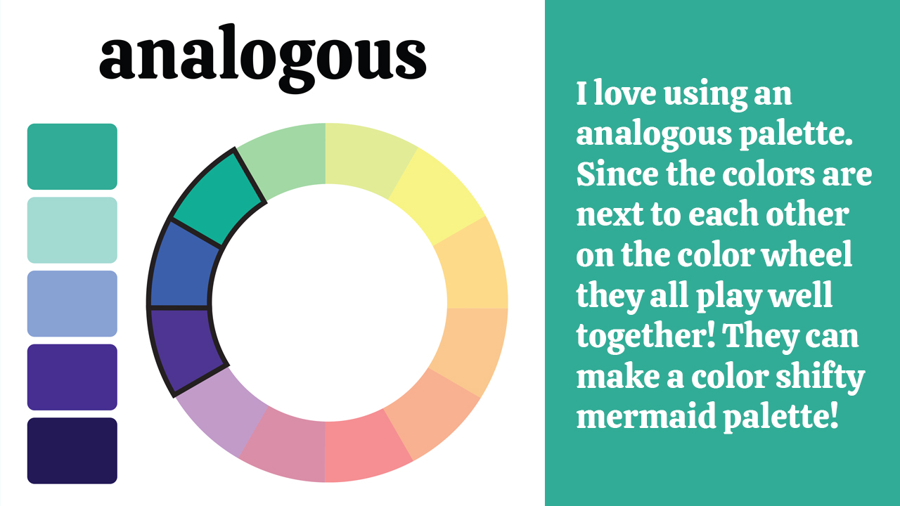
Next up, you could try an analogous palette. Analogous means “like each other” and gets it’s name from, you guessed it, the colors’ place on the color wheel! You can build an analogous palette by choosing three color families that lie directly next to each other on the wheel. I for one, love using blue, blue green, and green as a color-shifty magical mermaid palette.
• Helpful Tip: To add a pop to an analogous palette be sure to use from a wide spectrum of tints, tones, and shades. This will keep things from feeling one-note.
 Finally, let’s say you want a little more energy. A little more color variety. You probably want to try a complementary palette. By using colors that are found directly opposite of each other on the color wheel you actually make both shine! Think of sports teams, restaurants, or even some holiday colors. A LOT of them use complementary colors because they grab your attention and get you excited!
I will say that in art, using fully saturated complementary colors can be a little…too intense. My bonus tip for complementary colors is to choose one to be a saturated pop, and then use tints, tones and shades of the other. This will balance out all that eye popping energy. That way your colors never clash or overwhelm!
That's it! Easy right? I hope you remember these easy color palette tricks the next time you're feeling stuck!
Want to check this post out on Youtube? Click HERE!

News
Welcome to our blog. Here you will find current happenings and helpful resources. The blog is written by The Elder Cat, our resident grump who is jaded from living for over 300 years. Nonetheless, she is loved and knows many things. -Sarah Watts
Recent Posts
